Table 1 in a Research Paper: Example and Checklist
Build a clear participant-characteristics table with appropriate summaries, explicit denominators and a defensible role for comparisons.
Table 1 should help readers understand who contributed to the study and how relevant characteristics are distributed. It should not be a warehouse for every variable collected.
A strong participant-characteristics table is selective, clearly labelled and explicit about denominators. Its structure follows the study design and the reader’s needs, not a software command that happened to generate a long list of p-values.
In this guide
Decide what the table must explain
Include characteristics needed to understand the study population, setting and analysis. These may include age, relevant clinical or social characteristics and design-specific features. Avoid including sensitive or irrelevant details simply because they are available.
For an observational study, consider the exposure or comparison structure. For a randomised trial, baseline characteristics are typically shown by assigned group. A follow-up outcome belongs elsewhere unless there is a clearly justified reason to include it.
Use summaries that fit the variables
For categorical variables, report counts and percentages with clear denominators. For continuous variables, select summaries appropriate to the distribution and meaning—often mean and standard deviation, or median and interquartile range.
Do not decide solely from a normality-test p-value. Inspect the data and consider whether the chosen summary conveys the distribution adequately. State the unit: years, minutes, scores and currency are not interchangeable details.
Make missingness visible
In a fictional sample of 120 participants, 108 report education. If 54 completed secondary education, the percentage is 50% among those with education data, but 45% of all enrolled participants.
Either denominator may be presented for a clear purpose, but the table must say which was used. A note such as “Percentages use non-missing responses; missing counts are shown” prevents readers from reverse-engineering your arithmetic.
The STROBE. Checklist for cross-sectional studies. supports transparent reporting of participant characteristics and missing information in observational studies. Use the checklist appropriate to your actual design, not the cross-sectional version for every project.
Do not test randomisation with baseline p-values
In a randomised trial, significance tests of baseline differences are not a useful test of whether randomisation “worked”. Chance imbalances can occur, and a large p-value does not establish equivalence. The CONSORT 2025 explanation and elaboration: updated guideline for reporting randomised trials. addresses baseline reporting in randomised trials.
Assess the practical relevance of imbalances and follow the prespecified analysis plan. Do not choose adjustment variables solely because their baseline comparison reached a significance threshold.
For observational studies, comparisons may serve a different purpose, but a column of p-values still does not identify confounders or establish that groups are exchangeable. Explain why a comparison is needed and consider appropriate descriptive measures.
Keep the layout readable
Use informative row labels and consistent decimal precision. Put units in labels. Indent category levels under the parent variable. Avoid vertical clutter and repeated explanations inside cells.
If categories are mutually exclusive, check that counts reconcile with the stated denominator. For multiple-response questions, explain that percentages can exceed 100%. Distinguish standard deviation from standard error; they communicate different information.
Write a short accompanying paragraph
Do not repeat the whole table in prose. Highlight the characteristics that matter for interpreting the study, including important limitations in coverage or representation. Avoid claiming the sample is representative merely because its basic demographics look plausible.
A worked Table 1 example
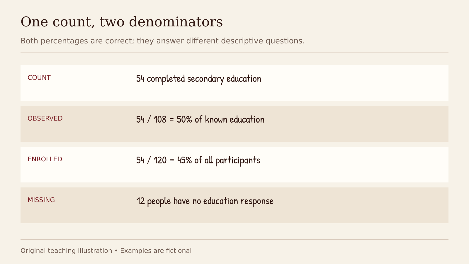
Both percentages are correct; they answer different descriptive questions.
This fictional one-group descriptive table uses 120 enrolled participants. All values are invented for teaching. A comparative study may need separate columns by exposure or assigned group.
| Characteristic | Summary | Missing, n |
|---|---|---|
| Age, years | Mean 34.2 (SD 9.1) | 0 |
| Travel time, minutes | Median 30 (IQR 20–50) | 4 |
| Education: below secondary | 36 (33.3%) | — |
| Education: secondary completed | 54 (50.0%) | — |
| Education: post-secondary | 18 (16.7%) | — |
| Education, any missing response | — | 12 |
Education percentages use the 108 observed responses: 36 + 54 + 18 = 108. Travel time is summarised for 116 participants. Here “secondary completed” and “post-secondary” are mutually exclusive highest-attainment categories. SD means standard deviation; IQR means interquartile range. The dash means no separate summary is presented, not a measured zero.
Before submission, ask a colleague to identify the sample size, missingness and meaning of every summary without reading the methods section. If they cannot, the table needs clearer labels or notes. Continue with how to report quantitative results for the broader results section.
Continue your research
Three useful next steps for this topic.
Research notes, once a week
Practical research guidance, useful tools and funding opportunities in your inbox.